How to Write a Professional Report That Delivers Results
Writing a professional report is all about what you do before you start writing. The real work—the strategic thinking that makes a report persuasive and clear—happens in the planning phase. This is what builds the foundation for a focused document that actually gets read and acted upon.
Mastering the Pre-Writing Phase
Before you even think about typing the first sentence, the most important part of writing a professional report is already underway. Truly great reports aren’t just written; they’re carefully engineered. This initial planning stage is what separates an impactful document that drives decisions from one that gets skimmed and forgotten. It’s about being strategic, not just busy.
This isn't just about knowing your audience and purpose in a generic sense. It’s about nailing down a razor-sharp objective that will guide every single decision you make, from the data you collect to the recommendations you present. Without that clear goal, a report can easily turn into a jumble of interesting but disconnected facts instead of a powerful communication tool.
Define a Crystal-Clear Objective
First things first, you need to answer a simple but crucial question: What is this report supposed to achieve? A vague goal like "update stakeholders on Q3 performance" just won't cut it.
A much stronger objective would be something like: "Demonstrate how our new marketing strategy boosted lead generation by 15% in Q3, and recommend allocating an additional 5% of the budget to scale the program." See the difference? It's specific, measurable, and points toward a clear action.
A report without a clear objective is like a ship without a rudder. It might be full of valuable cargo (your data), but it will just drift aimlessly without ever reaching its destination.
To really sharpen your objective, think about the one thing you want your readers to do after they finish reading. Do you need them to approve a budget? Change a process? Or just gain a deep understanding of a complex topic? Write that down in a single, actionable sentence. This becomes your north star.
Gather and Vet Your Information
Once you have a clear objective, your data-gathering process immediately becomes more targeted. You're no longer collecting everything you can find; you're hunting for the right information to support your goal.
Start by identifying the sources that will form the backbone of your analysis.
- Primary Sources: This is the data you own or gathered yourself. Think internal sales figures, results from a survey you just ran, or notes from direct interviews.
- Secondary Sources: This is information from the outside world, like industry reports, academic studies, or a deep dive into a competitor's public data.
The need for credible, structured data isn't new. For example, the U.S. National Intelligence Council has published its highly structured Global Trends report every four years since 1997. They do this to give policymakers a clear, strategic look at the future, all based on thoroughly vetted information. You can learn more about how governments use structured reports from the DNI website.
Create a Logical Preliminary Outline
With your data in hand, it's time to map out your argument with a preliminary outline. This doesn't have to be a masterpiece of detail just yet, but it should sketch out the main sections of your report. Think of it as the skeleton that will hold everything together.
This structure ensures your story flows logically from one point to the next, building a persuasive case as it goes. A solid outline is also a lifesaver when it comes to the document review process, as it gives your colleagues a clear roadmap to follow your thinking. This isn’t just about getting organized; it’s about paving a clear path to a compelling and effective final report.
2. Plan and Outline Your Report Structure
A great report doesn't just happen. It's built on a solid foundation. Think of the structure as the blueprint that guides your reader from a complicated issue to a clear, logical conclusion. Without it, you risk losing your audience in a sea of data.
Let's be realistic: most executives are pressed for time. They aren't going to read your report cover-to-cover. In my experience, they often read the executive summary, scan the headings, and jump straight to the recommendations. A clear structure makes this possible and ensures your most important points land, even with a quick skim.
Key Components of a Professional Report
Before you write a single word of the body, you need a plan. Nearly every effective professional report I've ever written or reviewed follows a similar, time-tested format. Each piece has a specific job to do.
Understanding what each section is for is crucial to building a coherent and persuasive document. This table breaks down the core purpose of each component.
| Report Section | Core Purpose |
|---|---|
| Executive Summary | A complete overview of the report—problem, findings, and recommendations—in a nutshell. |
| Introduction | Sets the scene by defining the report's purpose, scope, and necessary background context. |
| Body (Findings & Analysis) | The heart of the report; presents all your data, evidence, and analysis, organized logically. |
| Conclusion | Briefly recaps the main arguments and findings, reinforcing the key takeaways. |
| Recommendations | The "so what?" section; proposes clear, actionable steps based on your analysis. |
| Appendices | A place for supplementary information like raw data, detailed charts, or lengthy transcripts. |
This framework isn't just a suggestion; it's a proven method for making complex information digestible and ensuring your hard work gets the attention it deserves.
This image really drives home how a clear outline is the natural result of knowing your goals and doing your homework.
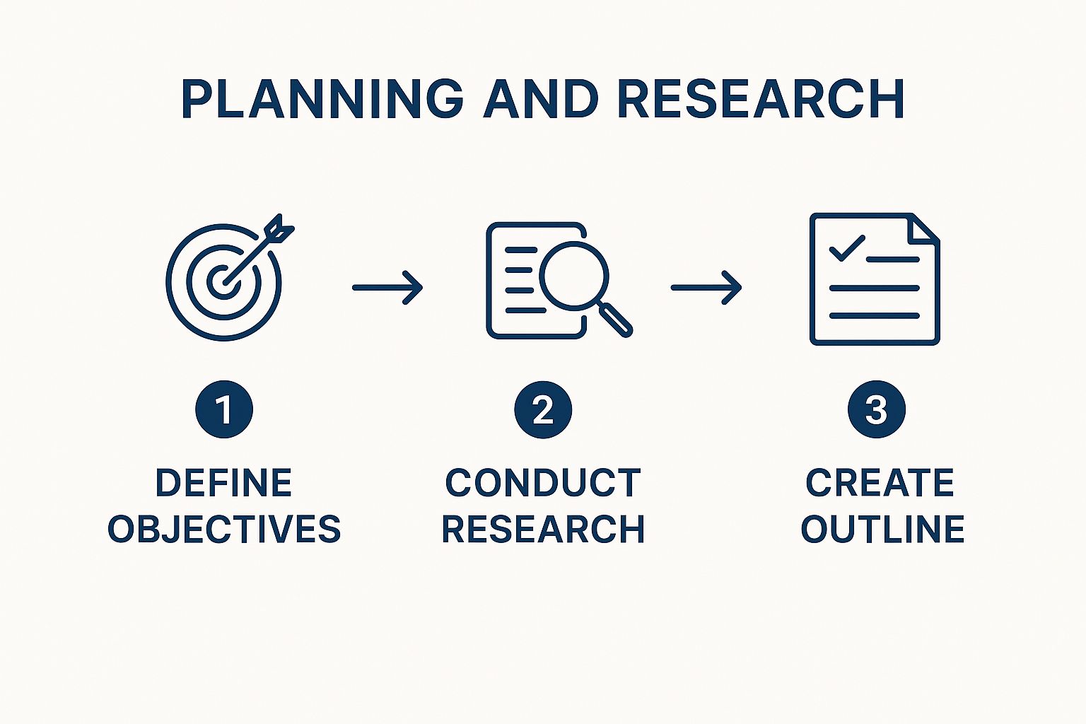
As you can see, the outline isn't just a list of topics—it's the bridge between your research and a readable, persuasive final document.
Use Headings and Subheadings to Create a Roadmap
Once you have the main sections figured out, it's time to break them down further. This is where headings and subheadings come in. They are the single most powerful tool for making your report scannable.
Think of them as signposts. They shatter intimidating walls of text and let a busy reader navigate directly to the information they care about most. A small change here makes a massive difference.
For instance, under a main heading like "Analysis of Q3 Sales Data," you could use subheadings like "Performance by Region," "Top-Performing Products," and "Impact of Recent Promotions." Suddenly, a dense section becomes easy to navigate.
A key takeaway: The goal of a report isn't just to be correct; it's to be understood. A logical structure shows respect for your reader's time and dramatically boosts the odds that they'll act on your findings.
Getting this structure right is a fundamental skill. It's a core part of creating any kind of effective business communication, a principle we explore further in our guide on documentation best practices. When your report is well-organized, it’s not just easier to read—it’s more credible, professional, and far more persuasive.
Transforming Data Into a Compelling Narrative

This is where the magic happens. You've gathered all your findings, and now it's time to turn that raw data into a story that grips your audience. Just dropping a bunch of tables and figures into a document won't cut it; you have to connect the dots and show people why it all matters.
Think of yourself as a translator. You’re taking the cold, hard language of numbers and turning it into something human: actionable business intelligence. The key is to adopt a confident, professional tone that’s clear and direct. Ditch the overly technical jargon that might leave stakeholders confused or, worse, make them tune out completely.
Weave Data Points Into a Coherent Story
A good report shouldn't read like a laundry list of disconnected facts. Instead, every finding should build on the one before it, creating a logical path that leads your reader straight to your main conclusion.
For example, don't just state a fact like, "Sales in the Northeast region decreased by 10%."
Give it context and build a narrative around it. Something like this: "Our analysis points to a 10% sales dip in the Northeast this quarter. This trend lines up perfectly with a major competitor launching their new product line in that same market, a development we started tracking back in early July."
See the difference? That approach turns a dry statistic into a crucial piece of a much larger puzzle. You're moving beyond just what happened and digging into the why—which is exactly what drives smarter business decisions. This is why learning to write a professional report is such a valuable skill in any industry.
Use Visuals as Evidence, Not Decoration
Charts, graphs, and tables are some of the best tools in your arsenal for making complex information easy to grasp. But they aren't just there to look pretty. Every single visual needs to serve a clear purpose by reinforcing a key point you're making in the text.
A well-placed chart can communicate in three seconds what might take you three paragraphs to explain. Use that power to your advantage. Strategically place visuals to emphasize your most critical findings and make your arguments far more persuasive.
Before you drop a chart into your report, stop and ask yourself: What specific point does this actually illustrate? Does it simplify a complex idea or reveal a trend more effectively than words ever could?
Here’s a simple, effective way to integrate them:
- Introduce the Visual: Give the reader a heads-up. For example, "The chart below breaks down the month-over-month growth in user engagement."
- Present the Visual: Place the chart or graph right after you introduce it.
- Explain the Takeaway: Immediately tell the reader what they should conclude from it. "As the data clearly shows, user engagement has climbed by a steady 25% since we rolled out the new feature."
Once your data is clean, getting a handle on data visualization best practices is the next logical step. Proper presentation ensures your visuals strengthen your narrative instead of cluttering it.
This storytelling approach is what makes your document more than just a report; it becomes a tool for persuasion and a solid foundation for business strategy. And when your report tells a clear story, it's also much easier to find and reference later—a core principle of the https://www.whisperit.ai/blog/document-management-best-practices that highly effective teams rely on.
Crafting Recommendations That Inspire Action

Let’s be honest. The real test of your report isn't how elegant your analysis is, but whether anything actually happens because of it. Your recommendations are that critical bridge between insight and outcome. This is the moment you translate all your hard work—the data collection, the number crunching, the careful storytelling—into a clear and compelling path forward.
A recommendation without a direct line back to your findings is just an opinion, and opinions are easy to dismiss. To make your proposals stick, you have to forge an undeniable link between the evidence you've laid out and the solution you're putting on the table. This builds a rock-solid case that gives leaders the confidence they need to make a decisive move.
From Vague Suggestions to Strategic Directives
Weak, passive language is the enemy of action. A suggestion like, "We should consider improving our social media presence," is dead on arrival. It's vague, non-committal, and frankly, unhelpful. It doesn’t tell anyone what to do next.
Let's transform that into a strategic directive. A much more powerful version sounds like this: "Allocate $5,000 in Q4 to a targeted Instagram ad campaign aimed at the 25-35 female demographic, based on the 35% engagement lift we saw in our pilot program." See the difference? It's specific, measurable, and directly tied to proven data.
The most effective recommendations aren't just suggestions; they are well-defended conclusions. After someone reads your analysis, your proposed next steps should feel like the only logical thing to do.
This shift in framing is everything. You’re not just tossing ideas around. You're handing over a clear, evidence-based plan that’s ready to be put into action.
Prioritize and Quantify for Maximum Impact
Decision-makers are busy, and budgets are always tight. They almost never have the resources to do everything you suggest. Your job is to guide them by prioritizing your recommendations based on their potential impact and how difficult they are to implement.
A simple, effective way to frame this is to categorize your proposals:
- Quick Wins: These are the low-hanging fruit—high-impact, low-effort actions that can deliver immediate, visible results and build momentum.
- Strategic Initiatives: Think bigger projects. They require a more significant investment of time and money but promise substantial long-term returns.
- Operational Improvements: These are often process changes that can boost efficiency or cut costs over time, making the whole operation run smoother.
For every single recommendation, you need to articulate the why. What’s the potential benefit or return on investment (ROI)? Paint a clear picture of what success looks like. For instance, data from consumer behavior reports can be incredibly powerful here. A 2023 analysis revealed that 72% of global consumers are willing to pay more for sustainable products. That's a powerful stat you can use to justify a recommendation for investing in eco-friendly packaging. You can discover more about using trend reports to find these kinds of game-changing insights.
When you present clear, prioritized, and quantified recommendations, you make the decision-making process incredibly simple for your audience. This mindset is key to creating an efficient document workflow automation culture in your organization, where reports don't just sit on a shelf—they drive action. It’s time to stop writing suggestions and start crafting strategic directives that get things done.
5. The Final Polish: From Good Draft to Flawless Report

You've put in the hours, crunched the numbers, and built a solid argument. Don't let all that hard work get undermined by a few avoidable mistakes. The final editing and proofreading stage is your last line of defense, transforming a good draft into a truly professional document that commands respect.
This is more than just running a spell-checker. You're now on the lookout for anything that could distract your reader—inconsistencies in tone, sloppy formatting, or confusing terminology. Getting this right is what separates an average report from an exceptional one.
Go Beyond the Basics of Spell-Check
Grammar and spell-check tools are a fantastic first pass, but they’re not foolproof. They can't tell you if your argument flows logically or if your tone feels right. To catch those deeper issues, you need to step away from the document for a bit. Give it a few hours, or even a full day if you can.
Coming back with fresh eyes is a game-changer. You’ll immediately notice awkward phrasing, repetitive sentences, and logical gaps that were invisible when you were deep in the weeds of writing. It’s a simple trick, but I’ve found it to be one of the most effective ways to self-edit.
The real goal of editing isn't just to catch typos. It's about refining your message until every single sentence is clear, concise, and serves a distinct purpose in strengthening your overall report.
Another great technique is reading your report out loud. Seriously. It forces you to slow down and makes you stumble over clunky sentences that your eyes might otherwise glide over. If it sounds awkward to say, it’s probably awkward to read. And even if you've had help from AI to get your draft started, this human touch is vital. It's always a good idea to spend time using AI humanizer tools to ensure a natural tone and make the text your own.
Create a Quick Final Review Checklist
To make sure you don't miss anything, a simple checklist can keep your final review focused and efficient. It doesn't need to be complicated, just something to guide you through a systematic final pass.
Here’s what I always include on mine:
- Consistency Check: Are all headings formatted identically? Is the terminology consistent? For example, if you start by saying "Q3 earnings," don't randomly switch to "third-quarter revenue" or "quarterly profits" later on unless there’s a specific reason.
- Data Accuracy: This is non-negotiable. Manually double-check every single number, date, and statistic against your original sources. One wrong digit can compromise the credibility of your entire report.
- Tone of Voice: Read a paragraph from the beginning, middle, and end. Does the report maintain a professional, confident, and objective tone throughout?
The Undeniable Value of a Fresh Perspective
Finally, and this might be the most important tip, never underestimate the power of a second set of eyes. You're just too close to the work at this point.
Ask a trusted colleague to give it a final read. They'll bring a completely fresh perspective and will almost certainly spot errors or unclear points you've become blind to. Be open to their feedback—the ultimate goal is to make the report as clear and impactful as possible.
For a deeper dive into this critical step, our guide on proofreading tips offers more specific techniques to make your final review even more effective.
Common Questions About Writing Reports
Even with the best plan in place, you're bound to hit a few snags or have questions pop up while you’re deep in the writing process. It happens to everyone. Getting caught up in the details or second-guessing your structure is completely normal.
Let's walk through some of the most common questions I hear. Having clear, practical answers to these frequent sticking points will help you push through with confidence and keep your momentum going.
How Long Should a Professional Report Be?
This is the classic "how long is a piece of string?" question, and the honest answer is: it depends. There’s no magic number. The right length for your report is dictated entirely by its purpose and who’s reading it.
A quick, informal update for your team might just be a single page. On the other hand, a comprehensive annual research report, complete with detailed data analysis, could easily stretch past 50 pages. The key is to let the content define the length, not the other way around. Your main goal is to get your point across as efficiently as possible without omitting critical information.
Focus on being thorough yet direct. A report is successful when it provides all essential information and nothing more. If a section doesn't directly support your main objective, it's probably just noise.
What Is the Most Important Section of a Report?
If I had to pick just one, it would be the Executive Summary. Hands down. Why? Because for many of your readers—especially busy executives and stakeholders—this might be the only section they read in its entirety. It absolutely has to stand on its own as a perfect miniature of your full report.
Think of it like this: if your boss only has 90 seconds to spare, the executive summary must deliver the whole story. It needs to cover the problem, your key findings, and your core recommendations, all in one tight, powerful package. Nail this section, and you guarantee your main message gets through, even if the rest is just skimmed.
How Do I Use Visuals Without Creating Clutter?
Visuals are there to clarify, not to complicate. The secret is to use them with purpose. Never drop in a chart or graph just for the sake of it. Every single visual should directly support a point you're making in the text.
Here are a few ground rules I always follow for using visuals effectively:
- Pick the Right Tool for the Job: Use line graphs to show trends over time. Bar charts are perfect for comparing distinct categories. Pie charts work best for showing parts of a whole.
- Label Everything Clearly: Every visual needs a descriptive title (e.g., "Figure 1: Q3 Sales Growth by Region") and clearly labeled axes. Don't make your reader guess what they're looking at.
- Give It Context: Always introduce the visual in the text right before it appears. After the visual, immediately explain the key takeaway. Tell the reader exactly what conclusion they should draw from it.
If you find yourself with tons of raw data or multiple complex tables, the appendix is your best friend. Moving them there keeps the body of your report clean and focused on the narrative.
Beyond these specific report-writing tactics, constantly working on your general business communication will pay dividends. For more great advice, check out these professional writing tips.